Quite a number of teachers have been asking me lately for ideas for Spelling games that they can use that are not just for a specific word list or for one group of students.
As you know I am a big believer in creating games and activities where the games themselves are kept relevantly simple and familiar. I do this so the students only have to process the new content as opposed to having to learn a new game and practice the content or skill.
I'm sharing today a game called Right or Wrong which is a sight/high frequency correct spelling identification game that can be played between 2 players. Feel free to adapt it for more than 2 players.
I have a few more Spelling ideas to share soon using Superheroes and a Phonemic Awareness game targeting practice of initial, medial and final identification, deletion and substitution of cvc words too!
The website is almost ready and I'm really looking forward to the holidays!
Call it design ADD but I'm not well pleased with the overall look of the new site so I'm working through a few more templates that I do like. I think I've got my placement and colour scheme sorted. In terms of layout it will be slightly different but more like a magazine style layout, particularly on the Home page.
Sorry for the wait....but while you are waiting you could in fact either follow this blog or perhaps leave a comment of encouragement or three. *grin*
Some of you have seen a brief preview of the new Treasure For Teachers Website and I'm actually quite excited to be putting the finishing touches on it over the next week. It should be live by Friday ( Week 6, Term 3 ) and I'm looking forward to being able to show it off on my ipad because there is no flash involved in this one. Ahhh such a rookie mistake. You live and learn, right? :)
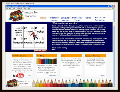
Here's a look see at the new Home page
This is what it looks like as of today ( Wednesday 17th August, 2011 )
There will also be a major change to how the pages appear. You will be able to see an image snapshot of each game, activity or printable so you know what you are looking for. I have also included the main reading, language or numeracy skill the printable is designed to help your student's practice.
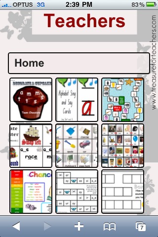
Have a look at a page from the Reading Games section
What do you think? I'm not sure about the orange at the moment, so that might change before the site is set free ;)
So to other news I am also working on a new Phonemic Awareness game called MasterChop. Yes, you did read that correct - it's not a typo.
I'll show you some screen captures soonish of that new game. I'm really excited to show you this one. It's similar in style to the Pirate Master Games but with a bit of a twist...or should I say chop? *smile*
Speaking of the Pirate Master Games, I've personally introduced them to a number of new schools and students in the past couple of months and I'd almost forgotten how much the students love to play this simple game. Particularly when they get a Pirate card and get to pinch someone's cards and win! Love the look of pure glee when that happens! But I am also loving seeing those lightbulb moments when some of these students realise that ai, ay & a_e all make the same sound! Love it! *grin*
That is what this job is all about and this is why I share all these games and printables with you all. More lightbulb moments & looks of glee please ! *big big grin*
Treasure for Teachers now has a new mini site that can be accessed on mobile devices. I haven't as yet switched from the flash based site so unfortunately the website is still unable to be accessed from both non flash based devices ( ie. iphone & ipad ) but if you are wanting to quickly show someone what one of the games look like you are able to do so or go straight to this blog from the mobile site!
I was browsing on my iPad this morning before peeling myself out from under the doona and hurling myself into the cold and miserable rainy day Sydney had to offer, and this article from LD Online grabbed my attention. Which is a pretty mean feat pre-caffeineation. Well done LD Online!
Now if you didn't follow the article link above here's the summary.
A graphic designer from the Netherlands Christian Boer created a font for those whose with willfull brains flips, mirrors or even rearranges letters and words on a page when they are just sensibly trying to increase their brains capacity with knowledge or figure out who Jen Aniston is dating this week.
What this font essentially does is thicken some of the letters, create a baseline for the eye, slants some of the letters and makes distinctions between those letters that can be easily exchanged.
I'm not sure about your reaction but I was surprised at how easily I was able to read that piece of text at the end.
Of course I now want this font.
But not starting at €165,01.
As usual the best things in education are not free. Or cheap. Or even alas moderately affordable. I really don't want to pay $218.00AU for a font. If you really want to have a look and are considering the price ( or think that perhaps I was incorrect with my translation of the page - please email me ASAP if I am ! ) then here is there website - Lexima
So of course I am now thinking of different fonts that may work in the same way. Surely there have been others who have worked on this. And I am positive there will be someone reading this post who is nodding their head right now and about to comment.
Dyslixc.com have a great list of fonts and rules for typeface.
I downloaded Lexia Readable from here which is free for non profit & educational use and reasonable for other use. I'll see how this one goes as an alternative to Comic Sans MS.
Website fonts
With regards to webfonts I am pleased to see my love for Trebuchet MS - the default font for this and all my other blogs and websites - is a good choice.
Apparently Geneva or Arial are solid choices as well. Personally I've never been sold on Arial. Or Times New Roman but that might just be my slightly rebellious side coming out. ;o)
Print Material
Yes, yes I hear you Graphic Designers of the world. You want to see Comic Sans MS tied to the nearest anchor, taken out to sea and dropped in without a word. Right?
Some of you may be asking "Why?" - you can read this here if you like. And play the game here.
Well too bad because there is research, new research yes I grant you but research all the same, that suggests these "harder to read" fonts - ironic really when you think about it - actually boost retention rates in comparison to reading from "easier fonts" such as Arial....article from BBC.co.uk here or here is the research paper from Princeton.
Now here is my personal opinion when it comes to creating print material and games. I started out my creative resource making journey many years ago totally sold out on Comic Sans MS until I got a little bored with it and was "encouraged strongly" to use Foundation font because "that is what the students are using in their own writing and modelling it will be useful".
So I did switch to NSW Foundation Print font but because it's not a strong, heavy typeface (remember I am just a teacher not a graphic designer here. Please don't make me learn another profession's jargon I have enough difficulty with our own! ) the resources never printed out as well and I started to notice that when used with reading fluency pages the students were generally not making the quick progress between levels as they may have previously.
I've switched back to Comic Sans MS now for a while and I'm fine with it.
Although let's see how this Lexia Readable goes. It looks good.
I'll let you know how I go and either leave a comment or email me and tell me what you think.


